Friday 30 September 2011

Montage-It! Week 1 Class

Model

The concept behind the Montage-It! module is to combine a range of media to create a complete image that communicates ideas and concepts about a building. 


Our first step was to create a model, drawing from one of three artworks given. My chosen inspiration was Eduardo Chillida's 'Mount Tindaya', shown below:


In my initial stages of brainstorming came to:

  • the solid nature of light
  • monolithic
  • light and scale
  • light's adaptability
  • transparency
  • volume
  • depth

Initial ideas

As a result, I wanted to try to create a donut-shaped space, with a bright light from the middle space shining out throughout the building. The building would comprise of many different rooms or spaces, that you moved through in a designed sequence that explores light at its brightest with shadows as the focus, to a space with almost no light where the light that was present was the focus.

After some more revision of the model, I decided to create a space that utilises these concepts, rather than showing them like an exhibition.
The main concepts I drew on were transparency and scale. As well as that, I wanted light to have a different purpose to just providing light. 


High angle view
Perspective view


My model is set on a thick cardboard base, and is made of balsa, butchers paper, a plastic bowl, mirror squares and a transparent jelly cup.
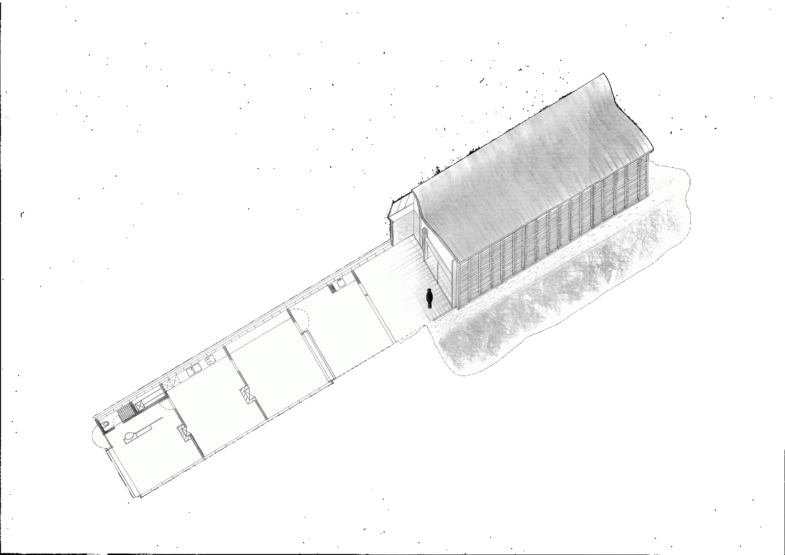
The building itself is actually quite large, about 5 times the height of a person, and the comparatively narrow entrance is designed to accentuate that. The translucency of the walls open up the building to its surrounding in a suggestive nature, but still keep an air of mystery about what it contains. This is particularly effective in night shots:

Night- perspective
Night- high angle


The light in the night shots isn't too bright or far-reaching as to draw a lot of attention, however it is mellow enough to have a slight character. It is created by placing a light at the hole in the base, where the jelly cup and mirrors distribute it in varying ways.


The jelly cup surface catches the light, so that the light isn't too bright, and the overall diversity in light gives the space a better dynamic. This variety allows for the space to be used in different ways, as this model is just a base for future addition of information through montaging.

Monday 26 September 2011

Draw-It! Poster

Characterising Architecture


My poster for an exhibition on drawing consists of two A2 pages, so that the flow from the length of the building is better and doesn't seem cut short.
For this poster I researched a bit more on layout, so that I could improve on my overall composition. I still feel the white space is disorganised, however by having a direction line along the middle I am able to visually guide the viewer to the information and control what has important over another.

The order of images relates to the theme of 'Characterising Architecture'. Through the process of drawing architectural drafts to experimenting with rendering, the effect a drawing style or form has on the character of your building became increasingly apparent to me.
Hence, the first (left) drawings are the elevations, representing a flat perspective, but still giving credit to the drawing type. The text follows, so that the viewer can be made aware that a change is to occur, and also because it balances the darker strip in the top right corner. Finally, a composition of different drawing styles and renders are composed together to compare the styles and the feelings from each. The images are arranged alternating around the coloured separator to accentuate the feeling of swapping over to a different style[/side]. Set translucent in the background, the floorplan ties everything in both as a base for a building but also to connect that each character expressed is still drawn from that same floor and that architectural drawings are important for this reason.


One disappointment with this poster is the image quality. On the verson of Photoshop that I have, I was unable to properly retain the detail of the rendering, and the transparency of the backgrounds. I fear this has hindered the professionalism of my poster. 


From this module, this experience of character has stood out the most to me, and so I felt obliged to respect that lesson in 'setting up' an exhibition in its honour. 

Tuesday 20 September 2011

Draw-It! Week 4 Class

Draw-It! Final Presentation


Unlike with the Model-It! module, the final presentation for this module was to create a composition of the drawings for your chosen house.

Because the plan oblique covered part of the floor plan, I decided to include it in the presentation. By setting it at the same angle (by overlaying it in Photoshop so that it the angle and size matched) I wished to make a connection between the two, and make it easier for a viewers eyes to compare the two.

Draw-It! presentation poster (A1)

I separated the poster into a top and bottom section to separate between architectural drawings and renders. The southern elevation was also aligned above the plan oblique to compare the slight difference between the north and south facing, while the west elevation was set to the right on purpose to suggest that that is the corresponding elevation following the one below it.

I chose to draw more attention to the perspective by enlarging it so that anyone looking at the poster would immediately and simply see the overall idea of the building before focusing on more detailed drawings. I felt this reflected how one would use different font sizes and styles to grab a readers attention in an article and set a hierarchy in the text. 


In hindsight, and following feedback from my tutors, I see that the black blocks do not add anything to the poster in the way of directing ones attention, and actually draw too much to themselves in their thickness and greater boldness than the drawings. There is also a disparity in the drawing styles due to the perspective, which now I understand. One of my challenges was to create a coherent space that didn't appear too empty, however I see how I could have used the white space more uniformly, rather than it having no structure and focusing on the arrangements of the drawings only. 
I hope to improve with my next poster.

Friday 16 September 2011

Draw-It! Week 3 Class & Take-Home

Plan Oblique

In this class we were introduced to plan oblique drawings, where your plan is offset at 30 degrees higher than the horizontal, and all vertical lines drawn following. Plan oblique differs from isometric in that in plan oblique, the real plan is used, giving a 90 degree corner to the plan and 60 and 30 degrees either side of it to complete the 180 degree horizontal. In isometric, the plan is offset on both sides by 30 degrees, skewing the plan to have a 120 degree angle. 


For my first week take-home task, I drafted my plans in 1:200 however I decided to do the floor plan again in 1:100 for future ease, as it provided more clear details. This is the plan that I used for the plan oblique drawing. 


Floor plan 1:100
Clearer details


I decided, instead of just drawing one part in oblique, to draw the entire plan and raise a part of it. In that way, it is easier to connect what part of the house is drawn and the section was more connectable to the corridor seen in the floor plan. The tiles I left out this time to focus more on the plan itself. Seeing as the plan oblique section would be rendered, it would be too cluttered to also have tiles on the floor plan, when they can be represented partially in rendering.
Completed plan oblique

The best advantage with this style of drawing is that I was able to detail the shutters on the norther side of the building in 3D so that it was clearer that they let light through. Although it took a long time to draw each precise line, ending part way at each column to show they're set in, it was well worth it as it achieved my desired effect.

Detail of shutters

The next step, and the task to take-home after finishing the plan oblique, was to render it. Having previously decided on the style I find most effective, I followed it for this drawing as well, for consistency.
The main challenge here was giving enough justice to the roof, without it looking like a rough colouring job, or a messy and quick render. The smudging technique here was harder than with the linearity of the steel renders. 


Final rendering of plan oblique


I also had inner walls to consider, which, if done too dark, wouldn't communicate the lightness of the interior. I opted for a light cover of dashes, similar to the ones I used on my early grass renders, to achieve a light, yet textured look. I slightly extended the pavement lines (which I did in the same manner as steel) to illustrate the glass door. The pavements were slightly tricky as there were two directions of lines, and smudging one direction would slightly rub out the other, and it was necessary to repeat the process a few times. 


The overall image I am pleased with, and I feel that plan obliques are a useful drawing tool when trying to provide details lost in plans and elevations. Particularly, rendering them can further detail materials that appear flat or can be many things in architectural drawings.


A final home-task was to do a perspective drawing of the Magney House. From a quick class exercise outside, drawing existing buildings, I found it easier to visualise the vanishing point for my house, and how the proportions worked.


I decided to draw the perspective sketchy to reflect the idea of the curves seen throughout the house. Seeing as the house is quite straight due to its length, if the lines weren't drawn perfectly straight then it wouldn't seem so austere and gave the building more character (an aim in communications).

Monday 12 September 2011

Draw-It! Week 2 Take-Home

Rendering Research

Our main task following week 2 was to research various rendering techniques, testing them on our drawings, and deciding which style we wanted to use for our final presentation.

First I tried watercolour and coloured pencils with the background. I only sketched the building, as that wasn't my focus here.

Water colour then pencil

The first attempt was to apply a very light and watered-out watercolour, trying to gradient it, and then applying a cross hatching on top radiating from the building. The cross hatching style is by Renzo Piano and I came across in my research, founding it quite light yet effective in representing the sky.


Close-up of water colour
and pencil rendering
Rendering by Renzo Piano


Next I tried applying the watercolour after the pencil hatching, to see if there was a different effect. I noticed with my first version that if the brush is slightly dry the individual bristles draw lines instead of giving one thick layer of watercolour. I tried to replicate that in this attempt however it didn't work to the same delicacy.

Pencil then watercolour

Colour pencil rendering on
the west elevation
Grass detail


The grass was done in the same style as the sky in the first watercolour/pencil render, and I believe it looks better; even though its more dense and the texture isn't as obvious, its more even.

I was still unsure about whether or not I like colour in the background, so I tried it on the west elevation in a different line-style. From these three drawings, I would prefer the sky from the first render, the grass from the second and the path from the third render.

Ink render

Focusing more on the building, I decided to experiment with ink as I felt that due to the houses already neutral facade I could just accentuate existing features, rather than introducing colour. Following this attempt, I was convinced that I prefer black and white rendering, however ink was too sharp and austere for a building that blends together so well.


To achieve a softer effect I tried using charcoal, used on smooth paper so that the lines were softer and also so that the charcoal wouldn't fracture where it was drawing from any rough paper. I used the southern elevation as it allowed for more room for experimentation. My main concern was representing the steel in a way I liked, and so this was my focus for my first drawing.

Many light lines
Solid lines
Only solid near the edges

Mixture


While working on these experimentations, I accidentally smudged a previous part with my hand while drawing the next one along. As a result I had achieved a light gradient line, thicker at the edges and thinning out where there was less charcoal. From this I attempted my next elevation. Not happy with the clearly fake shadow I had drawn, I also decided to exclude that from this attempt and focus on developing a better grass pattern. The comparative result is as follows:

Charcoal rendering development

This result was what I wanted to achieve. The lines on the building weren't too attention-drawing and the grass was dense enough, and not too straight or unclear. The grass effect was achieved using the side of a short piece of charcoal being drawn in curves at different angles. The steel, by drawing heavy lines at the poles/joints and then smudging (with a finger) these lines towards the centre (trying to keep the lines straight so that both sides would join in the middle).

Close-up of charcoal smudging
I continued my rendering work by working on the western elevation, drawing from my acquired. The western elevation also allowed me to include a road, and personally was a favourite elevation as it showed the beautiful roof and door designs by Murcutt.
After this final render I concluded that I had achieved the style I had been striving for, from a mixture of research and experimentation.


Final rendering result