Tuesday, 16 August 2011

Draw-It! Week 1 Class

Sketches

The first class exercise for the new module Draw-It! was to draw some sketches of two elevations, a section and a perspective (all in scale) of the first Model-It! class exercise: the joint houses. This new module is to explore various ways of drawing and rendering buildings, how to use it to communicate various aspects, and to learn areas of drawing such as scale and conventions.

I quite enjoyed the free movements of sketchiness, and extended this freedom in drawing each view at different angles (i.e. not necessariliy parallel to the edges of the paper). The drawings were also done on bakers paper as they were just preliminary drawings, and partly because its inexpensive. I enjoyed working with this paper- it felt nice both to move and under my pencils, but also, because it was inexpensive, you didn't have to worry about making too many mistakes so you could just focus on quick works.

(left) My initial attempt at an elevation. (right) My revised elevation

My main challenge was correctly drawing the elevation, as I was initially unconsciously drawing a perspective. It was particularly difficult to draw an elevation because my top house was at an angle, making any elevation look like a perspective. As a result, my first 'elevation' was a mix of both elevation (for the front house) and perspective (for the top house).

After much revision, the only way of fixing the elevation was to draw the roof more correctly, however the rest of the model was unchanged.

Second Elevation


One of the techniques I learnt is to shade objects that are closer darker. This gives depth to elevations (and especially perspectives) and works with the idea of drawing more detail at close distances.

The closer surface can also be outlined thicker for the same effect, and to give a focus to the drawing.


The section for the double house was comparatively simple, as there was nothing inside the houses that I cut through. To challenge myself, I made the cut through a window, and not along the ridge of the roof so that I had to consider more where the roof changed angles and how to represent the window.

Section drawing


The next task for the day way to sketch the plans/elevations given for our given house. My chosen house for this module was Glenn Murcutt's Magney House, which has a beautiful and open design.

Garage side and view of the back
Kitchen and view through the corridor
through the entire house
Light through the
shutters
 
Front view


The beauty of Murcutt's design is how light the entire building is, due to the extensive windows and open shutters. The curved roof serves as a drainage system, with water carried to either end of the building and down the pipes. Internally, even when there is a solid wall there are glass panes above the wall reaching to the roof, which gives a sense of connection throughout the whole length of the building, and helps in the feeling of openness.

Sketch of the floor plan and front elevation


In my sketches, I wanted to focus on just the walls, and accentuate the continuity of the corridor in the floor plan. It was quite difficult to read the plan at times, as there were lines which were unclear as to whether they were a wall, a guideline, or a window. All glass walls I wanted to draw either lighter, or as a dashed line, so that it was clear what spaces were the most open (as oppose to focusing on circulation).

The elevations I also tried to keep light, however it was difficult to give a sense of transparency when drawing the shutters, as they seemed like solid sheets of corrugated iron. The thicker-drawn poles do slightly  deter a viewer from seeing the shutters just as heavily.

Monday, 15 August 2011

Model-It! Poster

Modelling = Transformations

The final submission for the Model-It! module was to design a poster promoting an exhibition on model making.

I decided to focus on the value of models in opening ones eyes to different possibilities. Modelling can be used to grow ideas and are perfect to use as a maintainable physical representation of a building or space. Thus, the interplay between perspective, reality, scale and change are evident in my poster.

Model-It! Exhibition Poster

The silhouette on the right is of all my models stacked onto each other. I used this to again represent perspective, and how you can achieve so many different results through modelling and moreover the process of developing a model or idea.

One of my concerns lies with the cube, because it suggests the final product is already planned and foreseeable however I want to advocate the opposite. None-the-less, I decided to keep it as it did represent transformations from the first image, to the 3rd (which can be developed differently) to the last.

The overall composition I am quite happy with, with just the worry that it seems a tad cluttered.

Tuesday, 9 August 2011

Model-It! Week 4 Class

Model-It! Final Presentations

The final class for the Model-It! module was the presentation, submission and marking of all our works. Looking around the class, it was good to compare everyone's different methods of communicating through models. What details they decided to include or exclude, and particularly the many creative trees.

Before this module, I already felt comfortable modeling as from an early age I played around with wood and tools. That isn't to say I didn't learn anything.  The four week module helped me explore the freedom of modeling, and how it can be used in different ways to communicate different things. I feel there is a more convincing feeling to models, as oppose to drawings or 3D computer modeling, as you're able to hold and explore the model as you wish, and based on the scale you can see the building in various representations (for eg, in terms of context as with Fisher 1:200, or in terms of detail and interior, as with Fisher 1:50).

My final presentation

Following the first class exercise (the houses), the most important lesson I took from it was to avoid growing too great an attachment to your model, as this can stop you from doing things like cutting into them to join them into a previously unimagined outcome.

My lesson learn from the Barcelona Pavillion was that balsa is beautiful. Although I understood that materials don't have to be represented exactly, only through my mistake of doing so did it settle in my mind how much of a mistake it is to do so anyway. In particular, fake grass and trees should only be used for the final presentation of a model, not with prototypes, or ones communicating different things such as the public space and linearity of the building. Again, I already felt I had a theoretical understanding of scale and its important, I still chose to place little trees in the landscape that didn't show the true height, thinking that this would be simply to represent the presence of vegetation rather than the trees themselves. Another mistake, and another lesson learn through that. 

The most eye-opening exercise was the week 2 work with creating three models out of one shape. The process, I feel, was a great learning curb for me in breaking out of the mindset of enclosed spaces and flat grounded models to see how spaces can be turned upside-down and inside out. This is the importance of modeling- that it allows you to explore outcomes you couldn't imagine in your head without having something physical to work with.

Learning from my misjudgements with the Pavilion, I used my revised knowledge to construct the 1:200 model of the Fisher House. Out of all the take-home models I would have to admit this was the one I was most satisfied with, as I felt I was communicating everything that I wanted to, from the house itself to the trees.


The windows for the 1:50 Fisher House I was happy with because they were my focus for that model and in observing small details about the woodgrains and joints I believe I gave the proper respect they were due. The rest of the house, in particular the inner walls, weren't as neat as I would like them, and the lack of information regarding the internal structure hindered any precise representation. 


Overall, a point carried from all the home tasks was a more sturdy understanding of how to read various plans, elevations and contour maps. I highly enjoyed this module, and how it helped me learn in an area I already felt comfortable with, and now feel I can use as an effective communicative tool.

Monday, 8 August 2011

Model-It! Week 3 Take-Home

Fisher House 1:50 (in full)


Our final major model was to construct the full Fisher House in 1:50 showing all rooms. There was a slight challenge at times when there wasn't enough information in the plans to completely know what a window looked like, for lack of photos as well. 
As with the corner I made in our class task, I treated each wall (and window) with the same consideration of wood-grain and detail. The following video compiles my process:


I had difficulties keeping a consistent balsa tone throughout the entire model, and I was worried it would divert from the clean effect I was after. The darker shades I tried to use in the inset parts of windows, to give the illusion of being in the shade, however from the inside this didn't work as well.


Detail of how the basement
floor sat within the walls
Positioning the darker wood pieces
into the 'shaded' sections


The basement floor I made to fit inside the walls (similar to the Barcelona Pavilion) in order to hide any edges/joints on the outside, and to give a smooth exterior wall, as it is in reality. However, I didn't attempt the same with the 1st and 2nd level floors because of the numerous windows it would have to go around. Ideally, I would have liked to.


Although the interior walls are slightly crooked and the roof doesn't fit perfectly around the protruding chimney, I am very happy with my expression of the windows, which was my focus from the start. I believe in having to make the entire house, I understand much better than through any plans or drawings the workings of the house, and was able to explore the house with different lighting with ease.

Wednesday, 3 August 2011

Model-It! Week 3 Class Exercise

Fisher House 1:50 Interior Detail

For this four hour tutorial we had to complete, in 1:50, the famous window seat in the Fisher House. This corner of the house featured a fireplace, a seat integrated into the window, and a display of the creativity Kahn used when designing the windows for Fisher House.

Out of respect for his attention to the beauty of wood, I tried my best to follow the same wood grains, and create each beam on its own, rather than taking a piece of balsa and cutting out the shapes of the wood. This way, the structure was also more stable, as the direction of the woodgrains didn't allow for two windows to be cut out so close to each other.


Parts of the wall made separately
Putting together each element
The most challenging part in this task was constructing the elaborate box window and window sill in the corner, missing in the picture below. It proved difficult because on one side, the window had an indent, however on the other side of that indent there was a 'box' window through which you could look if sitting down. 

Almost finished walls, without the corner box window
Exterior of the window seat. Note the box window on
the left shares a side with the inset part left of the main window.

In order to capture the detail the architect went to to define his windows, I went to the effort of detailing the depth of a window sill and noted that at the corner the two walls joined into a corner beam. The last point also helped me have a clean corner, without any messy joints with one wall overlapping the other, or having to cut both walls at an angle.


Out of appreciation for the real beauty of the building,
I noted details such as the window sills and corner column

The curved chimney/fireplace was a little difficult to make cleanly, as can be seen at the base of the chimney. Also challenging was the trapezium-shaped interior of the fireplace that also needed to be made carefully to join all the pieces cleanly.
Although I was trying to capture details in the woodwork, I decided not to go to the lengths of scoring the wooden slats of the floor as I felt this would distract from the entirety of the model, through their strong directionality.
The final product, when placed under light imitating the natural direction, captures the open nature present throughout the whole house due to the excellent window designs.

Overview of the entire model

Perspective shot

Tuesday, 2 August 2011

Model-It! Week 2 Take-Home

Fisher House 1:200

A model of Luis Kahn's Fisher House was our given home task for week 2 of the Model-It! workshop. This two storey house, with basement, is two cubes that overlap at one of their tips, but it's main feature is exploration of windows throughout the entire house.

View from the river below
Fisher House entrance

The scale identified that this model was to focus on the context of the Fisher House, as its integration into the surrounding terrain was one of its important aspects. 


Process of adding each contour layer
I made the contours by cutting only the edge I needed, and leaving enough space for the next contour to sit on top. This was I was saving balsa by making only the edge of the contour, and by using off-cuts for parts that were hidden within the model. 
The contours were layered onto the base plan to ensure precision. I also had to mark the 'back' of the contour, so I didn't get the front of the curve confused with the part that's to be hidden.

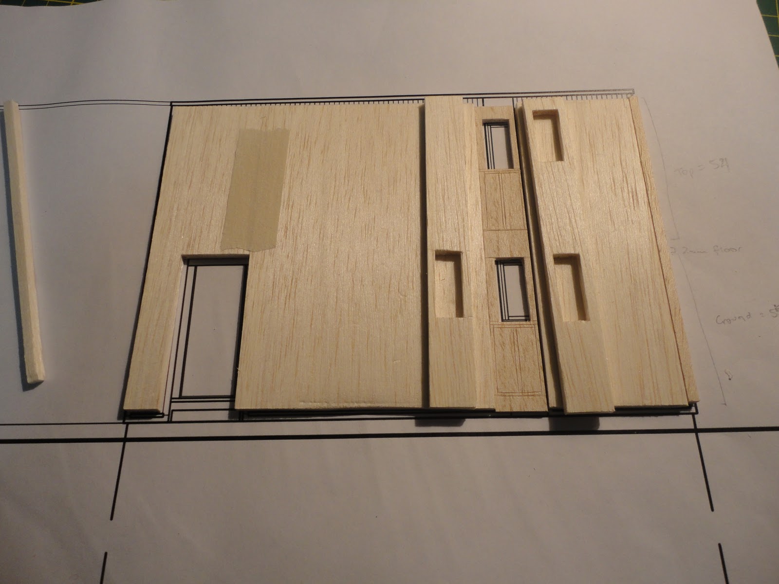
The house was constructed by making each wall, and making it a little longer than needed so that it could later be 'sunk' into the ground to the right height. I decided to make each window (as pain-staking as it was) to illustrate that the windows are there to connect the inside of the house to the outside landscape. Creating a solid box, I felt, wouldn't communicate this connection.

One of the walls, before windows
Details of the windows


The windows were made in the same manner as the pool for the Barcelona Pavillion. This time however, much greater care was need as this was on a smaller scale, and the windows would push on the wood grains and snap the delicate corners. Once the walls were put together, these issues were resolved.

Space for the joining of the two parts of the Fisher House


Joining the two houses was relatively simple: I just needed to cut out the corner slot in the roof, and that wall had to be cut into the two parts either side of the intersection. Even at this small scale, I cut the walls at an angle to ensure a good fit between the two houses. 


Finally, to put together the house and the terrain, I decided to fit the house into the hillside, rather than cutting out each contour as it would both be simpler, and 
would have less space for error. The only barriers I faced with this step was the internal supports which I had to cut through underneath the contours. Overall, I was happy with the result.

Side of the house upon fitting
Slot for the houses to fit into


To finish the model off, I made trees/bushes from scrap foam I had. The bridge was made to emphasise the presence of the river, which followed a different wood grain to symbolise a different material to the contoured landscape.

The final product

Front of the house

Wednesday, 27 July 2011

Model-It! Week 2 Class Exercise

Building from a shape

This weeks task was to explore how one shape can be transformed into a myriad of spaces. The shape given to us was the elevation of my first model below, and we were to use this shape to create 3 different models.


Our base shape


For my first model (picture above), instead of building just a box or house, I tried to make one elevation bigger than the other, so that the model would expand in a pyramid-like manner.
Even in doing so, I was still disappointed in my un-inspired model, as there was little creativity in it, and was just one solid. 


Final model 1, and inspiration for model 2
The cut-out of one of the elevations inspired me to explore negative space, the opposite of my first model. Using the cut out as a template, I decided to make a model that would reveal this shape only at certain angles. I didn't want the shape to be the centre of attention, so I added small features and extensions to give the model itself a purpose, rather than just the shape it was drawn from. The result is the following:


The angle at which the base
shape can be seen
Presentation shot of my second model


For my final model, I took the idea of thinking outside the shape even further. Using it only as a base, I didn't want it to be seen at all, unless the viewer knew it was there. After scoring the shape onto a flat piece of balsa, I extended the lines, and scored more lines to integrate it into a series of lines and patterns. I cut out 'mosaic' shapes that would fill in only the original shape, and stood them up various ways so that the original shape would only appear if you folded down the protruding shapes onto the flat piece.

Building up the pieces for my final model

I was very happy with the final result, as I felt I had made some progress to avoid uncreative and flat models. I found this task one of the most challenging so far for that reason alone- as it's very hard to materialise something amazing when you have so many options open to you.

Shadow effects on my final model
Detail of the scoring